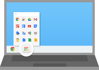
So after the recent Chrome update, suddenly my Chrome App Shortcut extension dissappeared and was replaced with the history panel, which was also rather uglily miniturized. Initially I thought I messed up my Chrome settings but couldn't remember if I changed any settings. It was as though I had some amnesia to what I did wrong to Google Chrome.
Searching around the internet, I couldn't find any information about the changes either. For many days I was left wondering what happened to my browser.
Flashing Sidebar in Gmail Contacts
At the same time, my Gmail Contact page sidebar was flashing too. I thought it was related to the recent Chrome update (but it wasn't, but I didn't know) since the issue occurred at the same time. Eventually I found a solution online about the flashing sidebar. Somehow I might have accidently set the zoom level to 90%. And it was causing to jump between 90% to 100% and vice-versa causing the sidebar to flicker and flash. It was truly irritating. The fix was simple, just reset the zoom level back to 100% and it was fixed! This bug only happens in Chrome.
Chrome App Launcher Found
Anyway, my Chrome Apps extension was still missing until I noticed the Apps button on my bookmark bar. Clicking on it brought backed all my apps shortcut extension page! At the same time the help information came up and explained about this new way of accessing your apps extension including one located on your Windows taskbar!
So what did I think about this new way of doing things?
The app launcher in the taskbar could be useful. On the other hand, I have survived so long without it, I think it was really unnecessary. Since it was just a program, simply just unpin it to remove it. If you decide later that you like to have it, simple go to the All Programs in the Windows Start button and find it under Google Chrome, run it and pin it to the task bar.

As for the Chrome version sitting at the bookmarks bar?
This could have been better. I was so used to having it appear when I created a new browser tab, now when making a new browser tab, the history panel showed up instead. Previously you have a choice to slide it between history panel or app launcher. Now you have no choice at all! You are now completely stuck with the history panel. And to get to the apps launcher is a two step process. Make a new tab, then click on the Apps button to access your apps shortcut launcher.
Frankly, making a one step process into a two step process waste time and reduces our productivity. So whoever came up with this idea must have a lot of time in their hands to click here and there to get their job done.
In terms of smooth workflow, Microsoft is a little bit better at it than Google. Although they still fail at some point or another. However the recent many changes by Google has made the workflow process of doing things rather more tedious. Why add more steps to doing the same thing as before?
The developer should consider how to reduce the number of times a user has to click before finally reaching their intended result. Even adding just one more click from the previous way of doing things actually made it more annoying. Especially if it was something that has to be repeatedly done several times in day and everyday for the rest of time using it.
Anyway, enough of my kvetching. This year's isn't a good year, with the downturn in economy and many companies trying to bolster up their sales figures, and sales staffs not meeting with the sales quota, plus the fact that poorer economy meant crime rates are going up in my part of the world and government making a poor job at managing the country. So coupled with some crazy engineer coming with less than appealing changes to the app interface really kick sand into my eyes.
I'm sure many users would not be pleased with these annoying changes. Unfortunately what seemed like a good idea with Google meant that us users has to gripe with it for our daily use. I switched over to Chrome because it was a faster browser than others (namely IE, Firefox, Opera, etc). I was a heavy Firefox user before, but Firefox was having way too many updates (at one point every few days mind you!) and slower start up which meant waiting around for the app to get ready before I could use it is a lot of wasted time. If changes in Chrome browser also made it difficult for users like me, I probably will have to swap back to using Mozilla Firefox or heaven forbid! Back to Internet Explorer!
[update 30/Sep/2013]
The rectification by Google Chrome was rather quick. Everything is now back in order! (but not quite)
[update 15/1/2014]
I found a solution to get back some semblance of the history page / app page slide. Some smart guy made a plugin extension for Chrome, it's called the "new tab redirect".
After installed, change the new tab to show this URL: chrome-internal://newtab/
Voila, back to same old style Chrome browser whenever you click on the new tab. Kudos to the developer!


No comments:
Post a Comment